Project 02 — Mobile Application
Iwave
Connecting students with scholarships, on-campus positions, donations & student jobs — all in one platform
Anyone who wants higher education has the right to study.
While UNESCO presents high tuition fees and exclusive entrance examinations as two main institutional barriers, tuition and cost of living shouldn't be an obstacle for students. Students should be informed easily about opportunities like grants, sponsorships, and financial aids — from private to public, from personal to organisation.
Iwave is a platform that aggregates all types of academic financial aids and opportunities in one place — organised, fast, and social. Students can apply, connect, and wave support to peers on their path to education.
Five students.
One recurring story.
Before a single screen was designed, five semi-structured interviews were run with university students actively searching for financial aid — a mix of undergraduates and postgraduates recruited through university career centres and student groups, plus one conversation with a scholarship fund's program director.
The same three problems surfaced again and again: opportunities are found too late, spread across too many disconnected sources, and applying feels like shouting into a void with no feedback.
Two flows.
One vision.
Interaction recordings capturing the Iwave student journey — from scholarship discovery through to the refined final prototype with a complete visual and interaction language.
Try it
yourself.
A working click-through of the Iwave app — switch between the Student and Founder journeys, browse scholarships, review candidates, and submit an application, all inside a live mobile mockup.
Six sessions.
Three real fixes.
The interactive prototype was handed to six participants — four students and two supporters — for moderated, task-based usability sessions run remotely and in person. Each person was asked to discover a scholarship, submit an application, and (for supporters) review a candidate, thinking aloud the whole way through.
Every session was scored on task completion and followed by a short debrief. The friction points that came up more than once were treated as real problems, not one-off confusion, and fed straight back into the prototype.
Three of six testers scrolled straight past the "View & apply" button on the first scholarship card, looking for a separate apply tab.
FixMoved the primary action into a fixed, high-contrast button and added a persistent tab-bar shortcut to it.
On the supporter side, testers couldn't tell at a glance whether a candidate had already been reviewed.
FixAdded visible status chips — Reviewed, Funded, Declined — directly on each candidate card.
The motivation-letter field felt like a dead end — nobody was sure if their edits were actually saved.
FixAdded an inline autosave confirmation and a visible character count under the field.
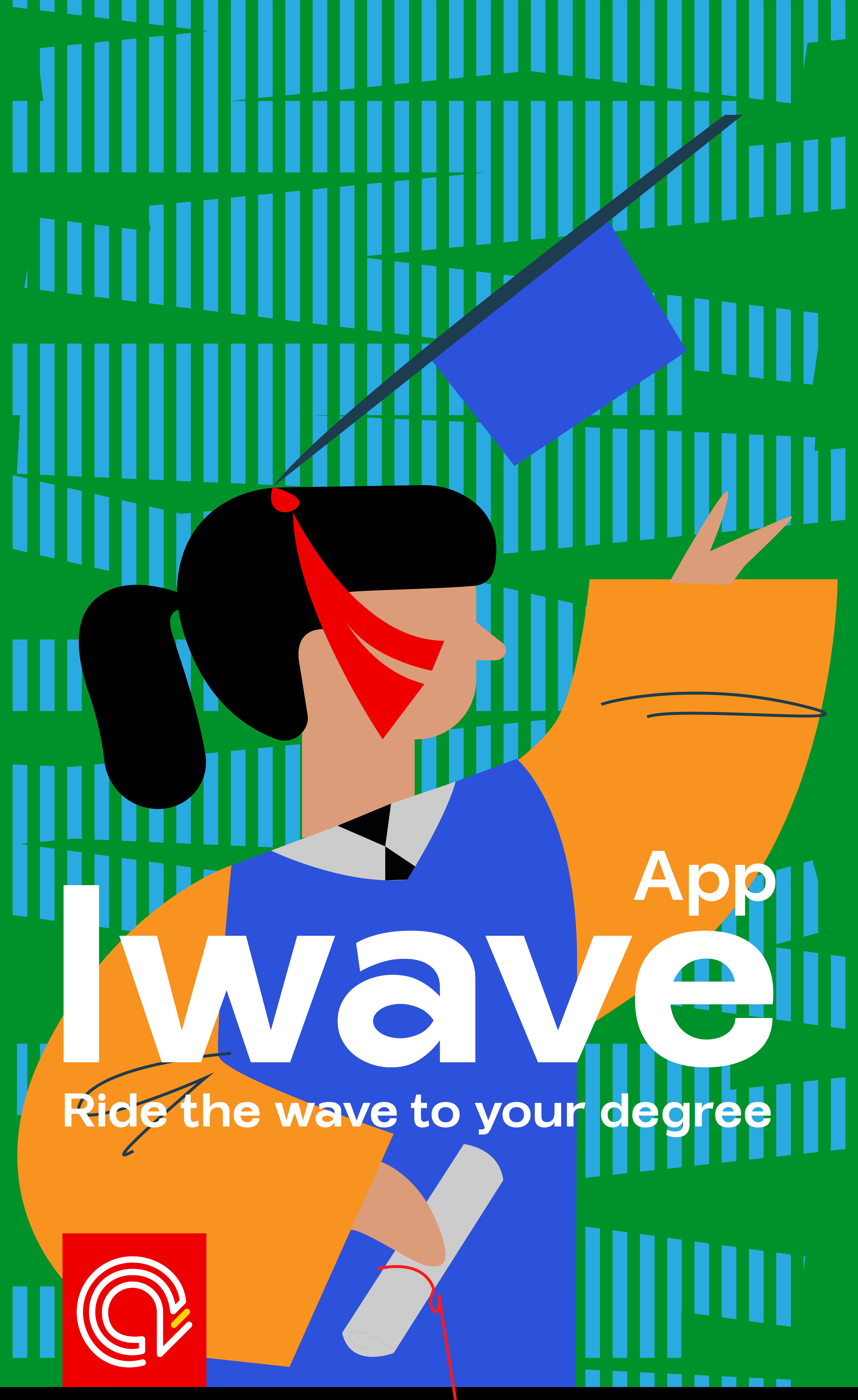
Ride the wave
to your degree.
A bold, graphic poster designed to capture the spirit of Iwave — the energy of a graduating student, the optimism of opportunity, and the visual identity of the platform in a single frame.
The layered illustration combines flat geometric shapes with the Iwave logo mark and wordmark, set against a vibrant green-and-blue rhythm that references waves of movement and momentum.
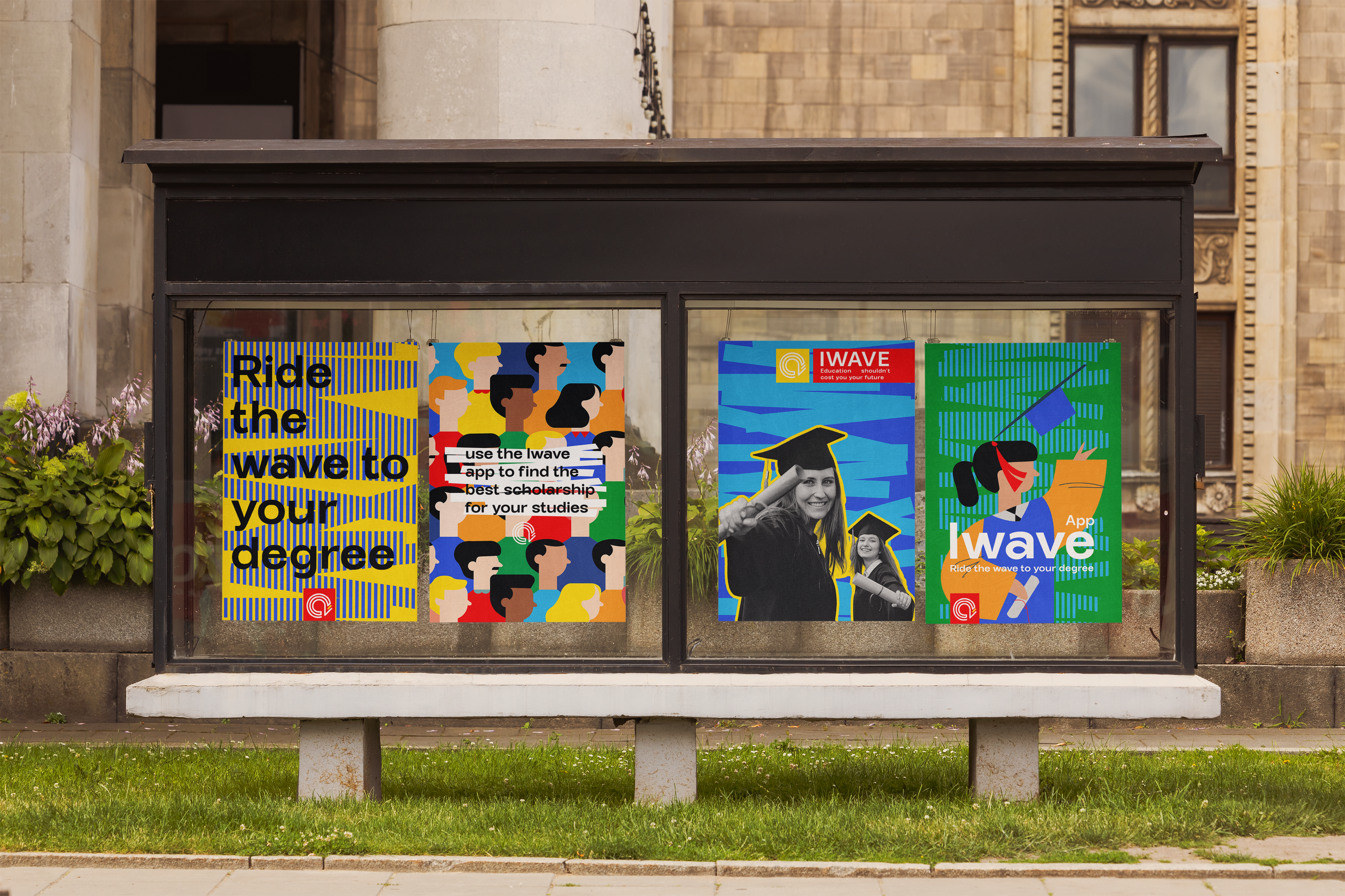
Out of home,
in the wild.

Dual-role platform with distinct user journeys
Iwave is built for two audiences: students seeking support and supporters looking to give. Both enter the same platform but follow tailored flows — from discovery and application through to payment and communication.
The architecture prioritises speed of access. From the home feed, a student reaches a scholarship listing, attaches their CV and SOP, and submits — in under three screens.