UI/UX Design · Brand Identity · Product Design
Palem

A connected plant care platform that bridges the distance between people and their plants — through a smart sensor, a thoughtful app, and a visual identity rooted in life and growth.

Year 2025
Role Designer
Type App + Brand
Scroll
Challenge
Most people love plants but lack the knowledge and time to keep them healthy. Palem turns passive plant ownership into an active, informed relationship.
Discipline
UI Design UX Research Brand Identity Motion
Platform
iOS Mobile App
Smart Hardware Sensor
The Concept

Make Your Plants
Great Again

Palem starts with a simple truth: most plant owners want to do right by their plants but don't know how. They forget watering schedules, misread sunlight needs, and feel helpless when leaves start to yellow. The result — a revolving door of dead plants and guilt.

The solution is a connected ecosystem — a small wireless sensor placed in the soil that reads moisture, light, and temperature in real time, feeding that data directly to the Palem app where it is translated into plain, actionable care instructions.

67%
of plant owners have killed a plant they loved
better plant health with data-driven reminders
Palem campaign visual — creation of connection
Campaign Visual · 2025

Identity
in Motion

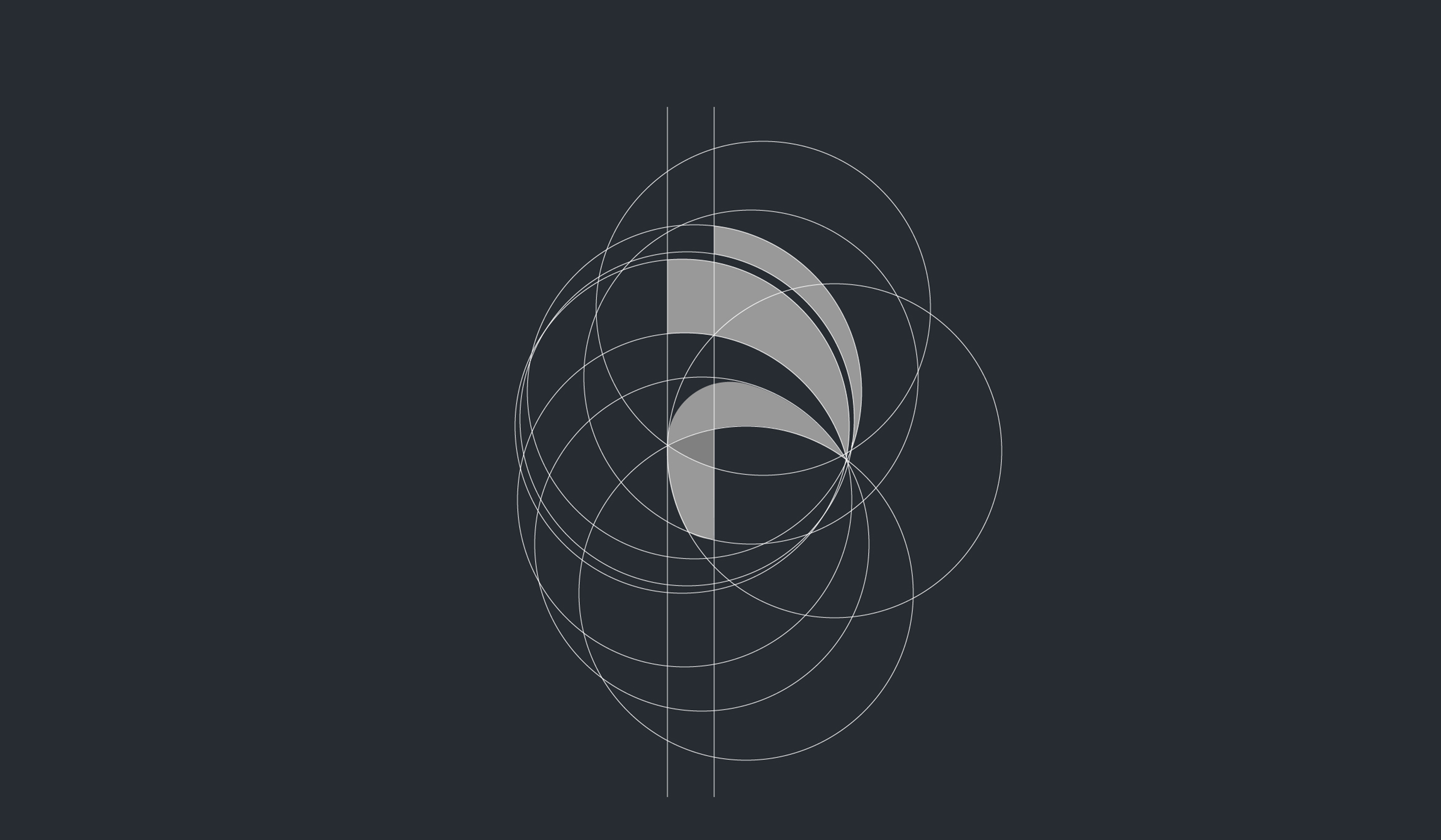
The Palem logo is constructed from overlapping geometric arcs — a visual metaphor for growth, cyclical care, and the relationship between organism and environment. The animation reveals this geometry frame by frame.

Logo Animation · After Effects
Visual Identity

Brand
World

The Lizard Knows

Lizards don't shed because something went wrong. They shed because they outgrew what was containing them.

The old skin becomes a cage — and they walk out of it without looking back. It's not repair. It's not recovery. It's evolution happening quietly, on schedule, in the dirt.

That maps perfectly to Palem. Your plant isn't broken — it's being held back by soil that no longer serves it. Palem reads the minerals, the moisture, the invisible chemistry underneath, and tells you exactly what the plant needs to shed and what it needs next.

The brand identity carries that same logic. Nothing decorative. Nothing extra. Just the precise, quiet signal that something is ready to grow — and now it can.

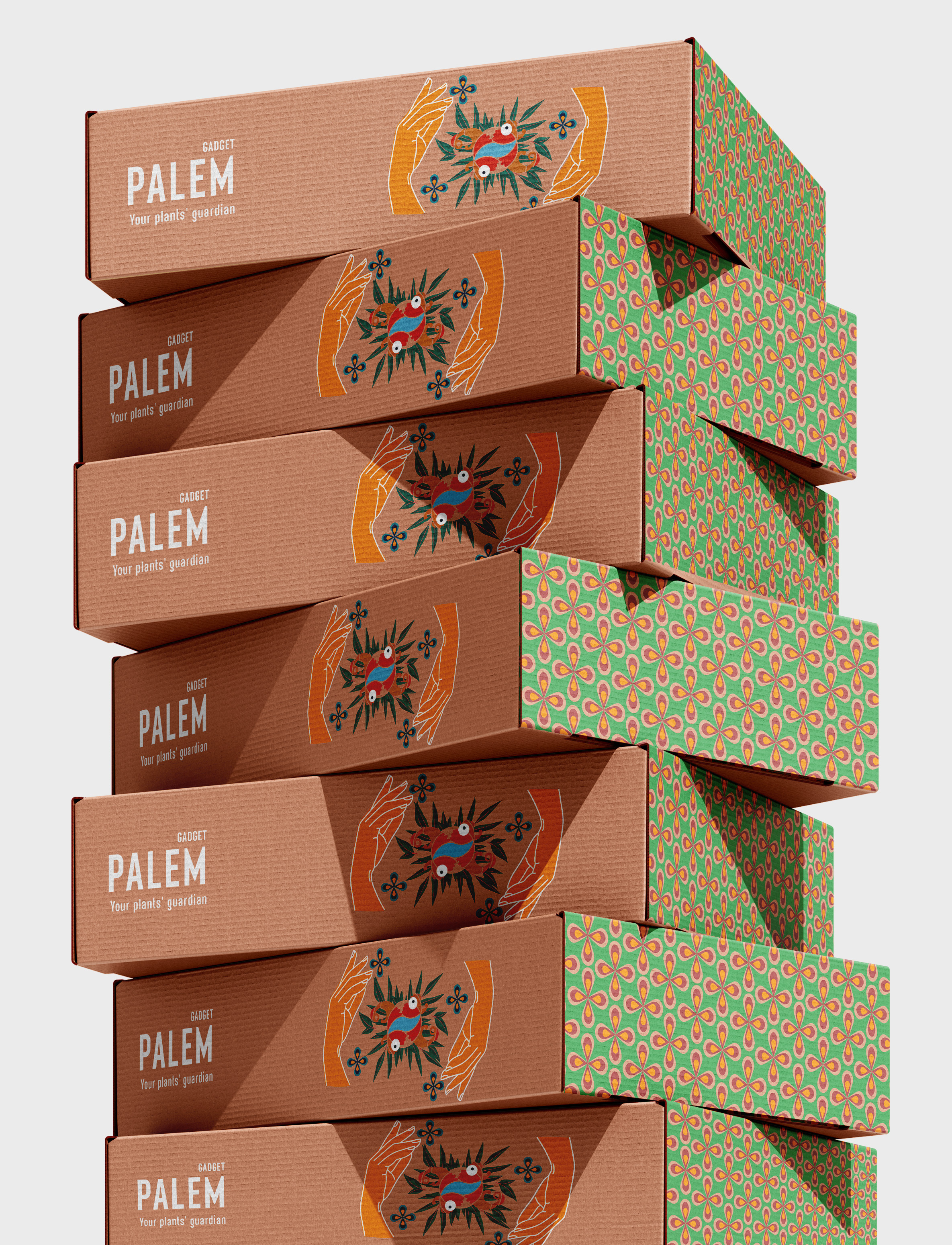
Palem packaging
Product Packaging · Brand System
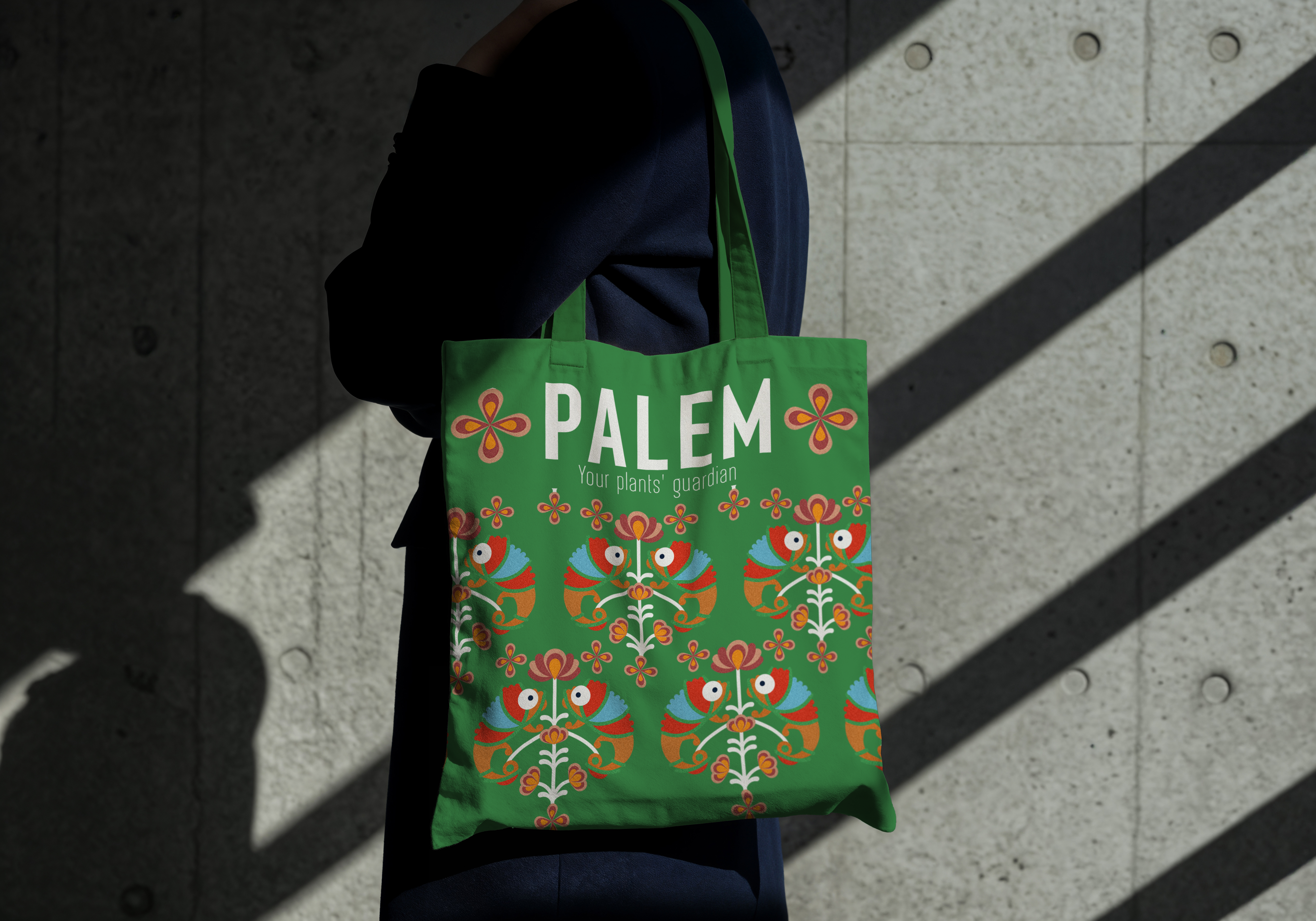
Palem tote bag
Merchandise · Tote Bag
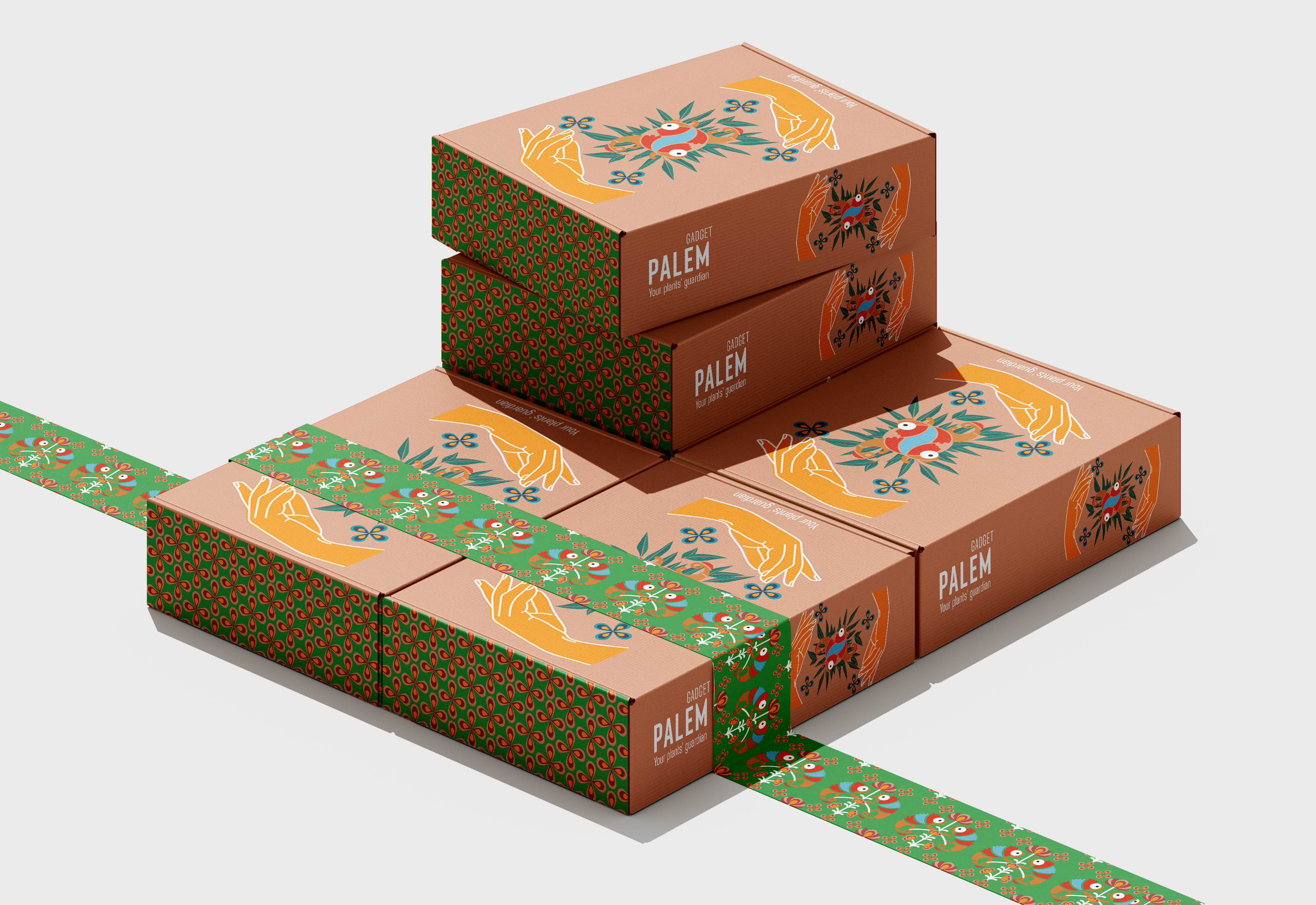
Palem box collection
Product Packaging · Collection
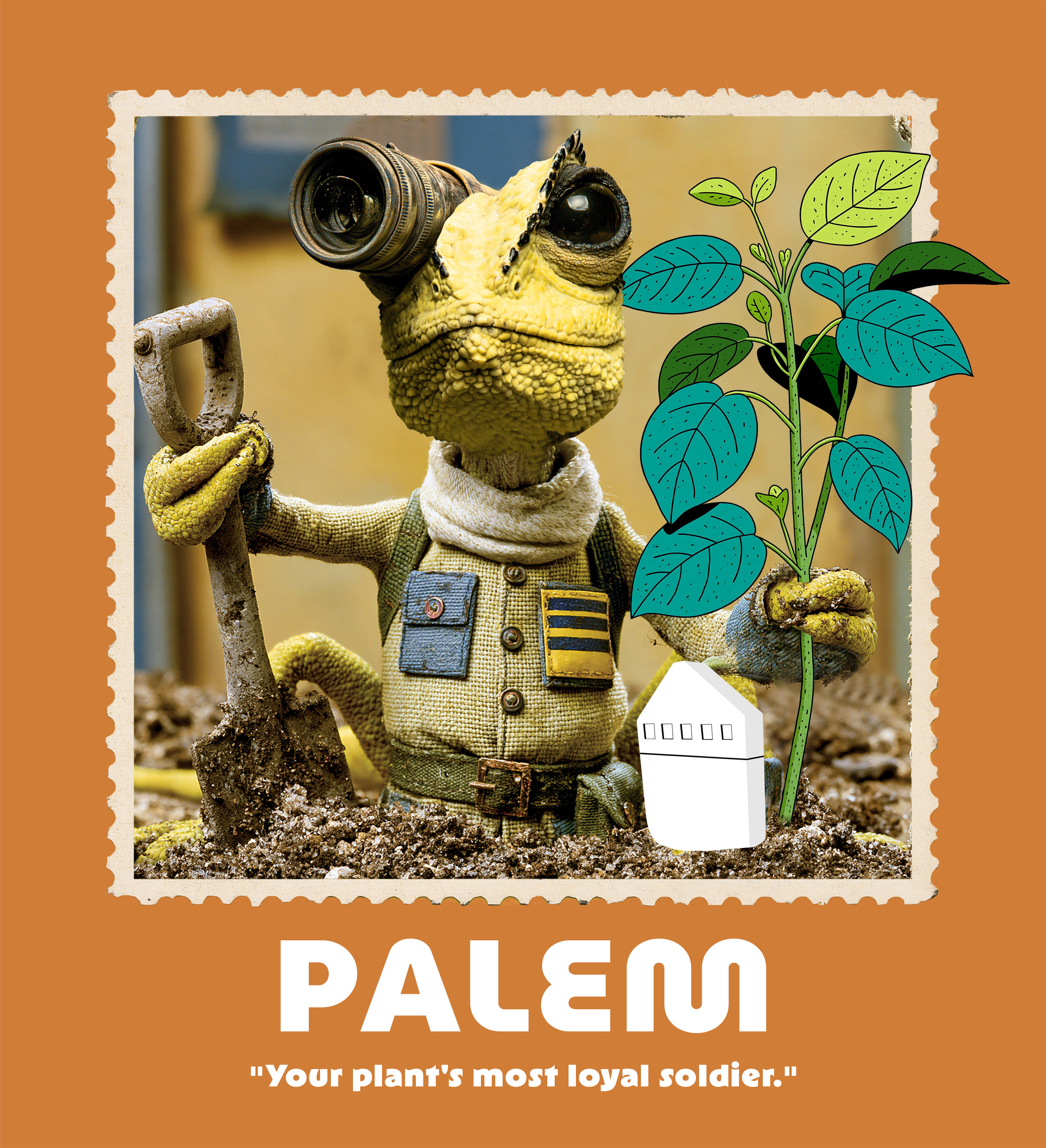
Palem — Your plant's most loyal soldier
Campaign Poster · Lizard Series
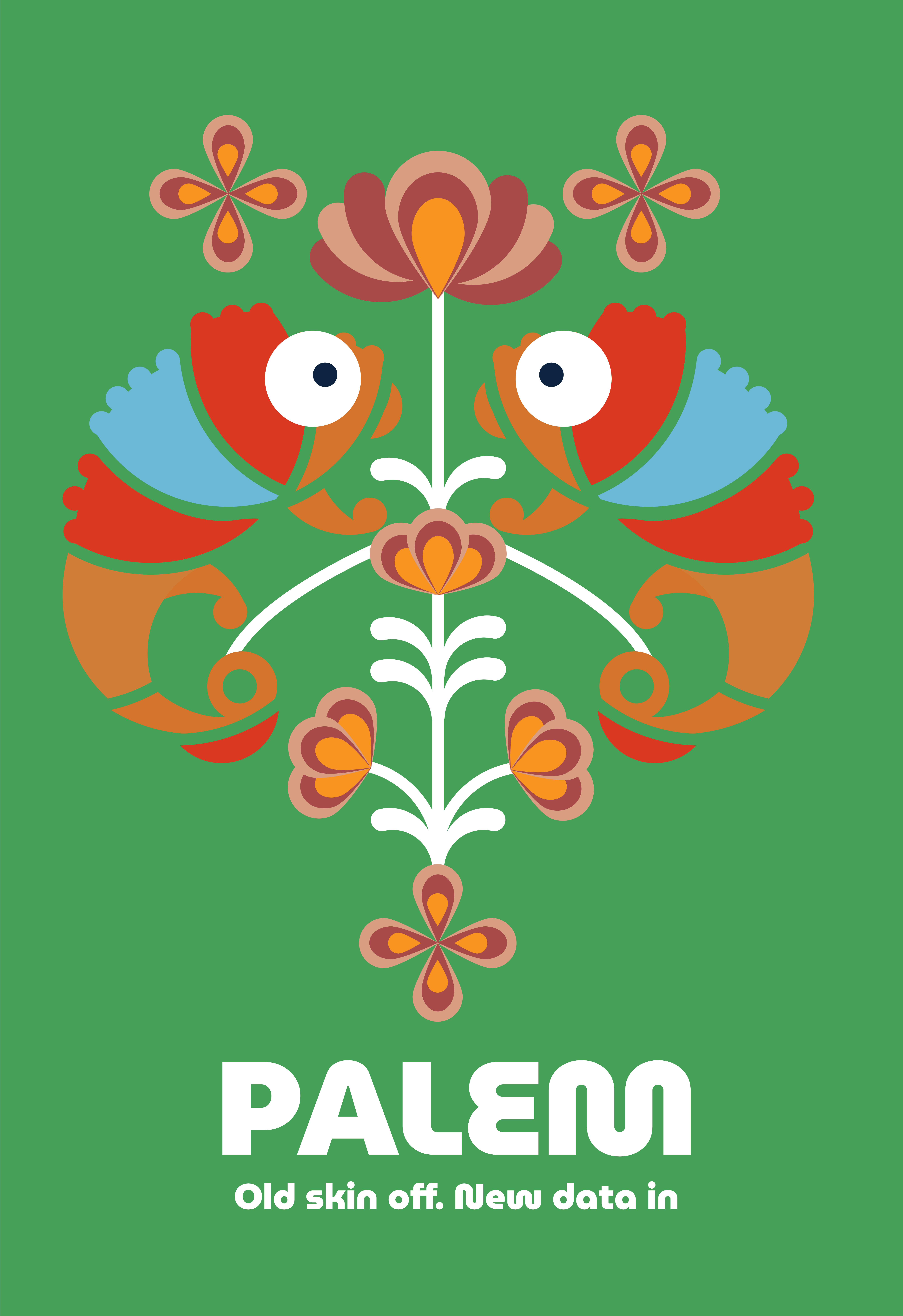
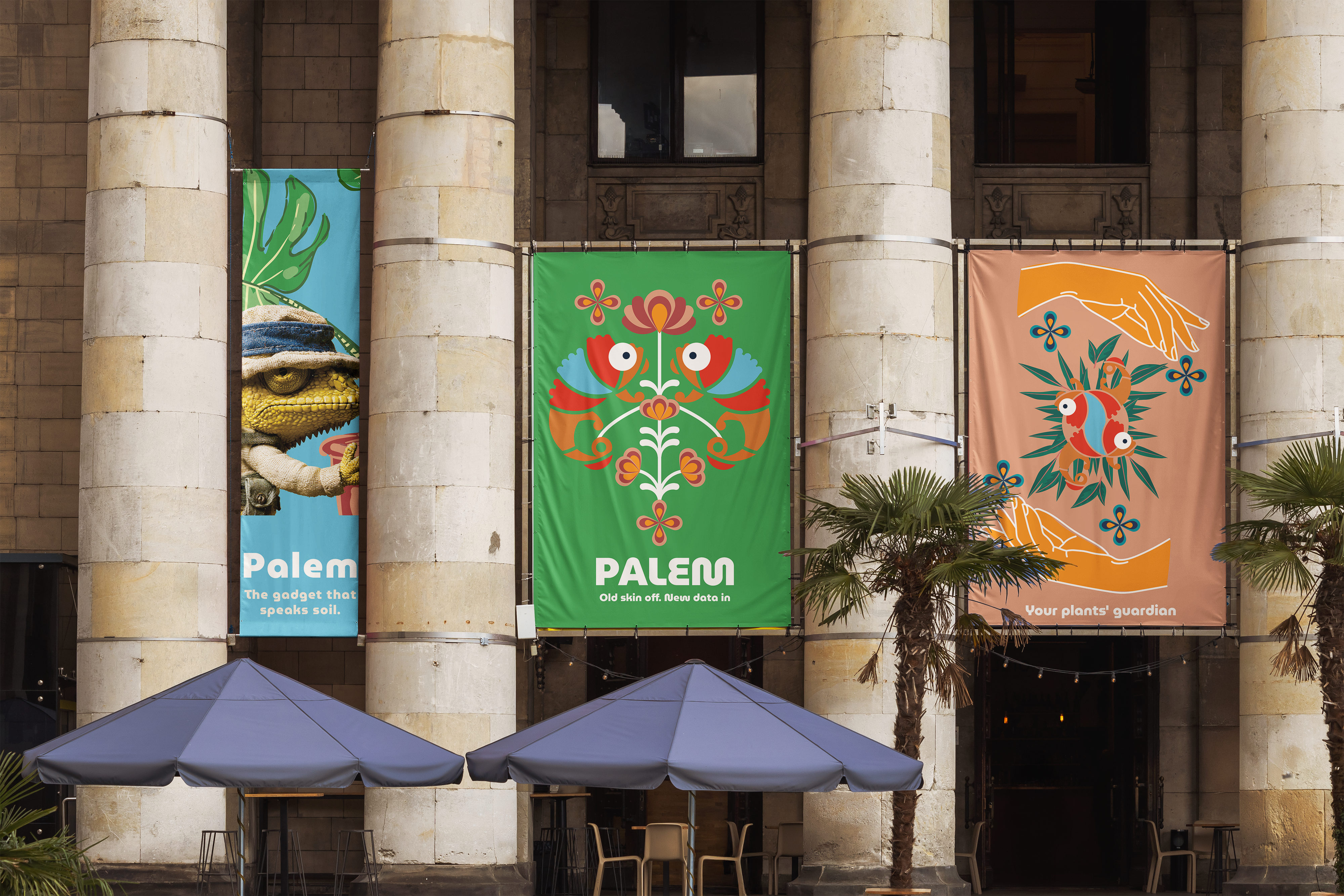
Palem — Old skin off. New data in
Campaign Poster · Folk Illustration
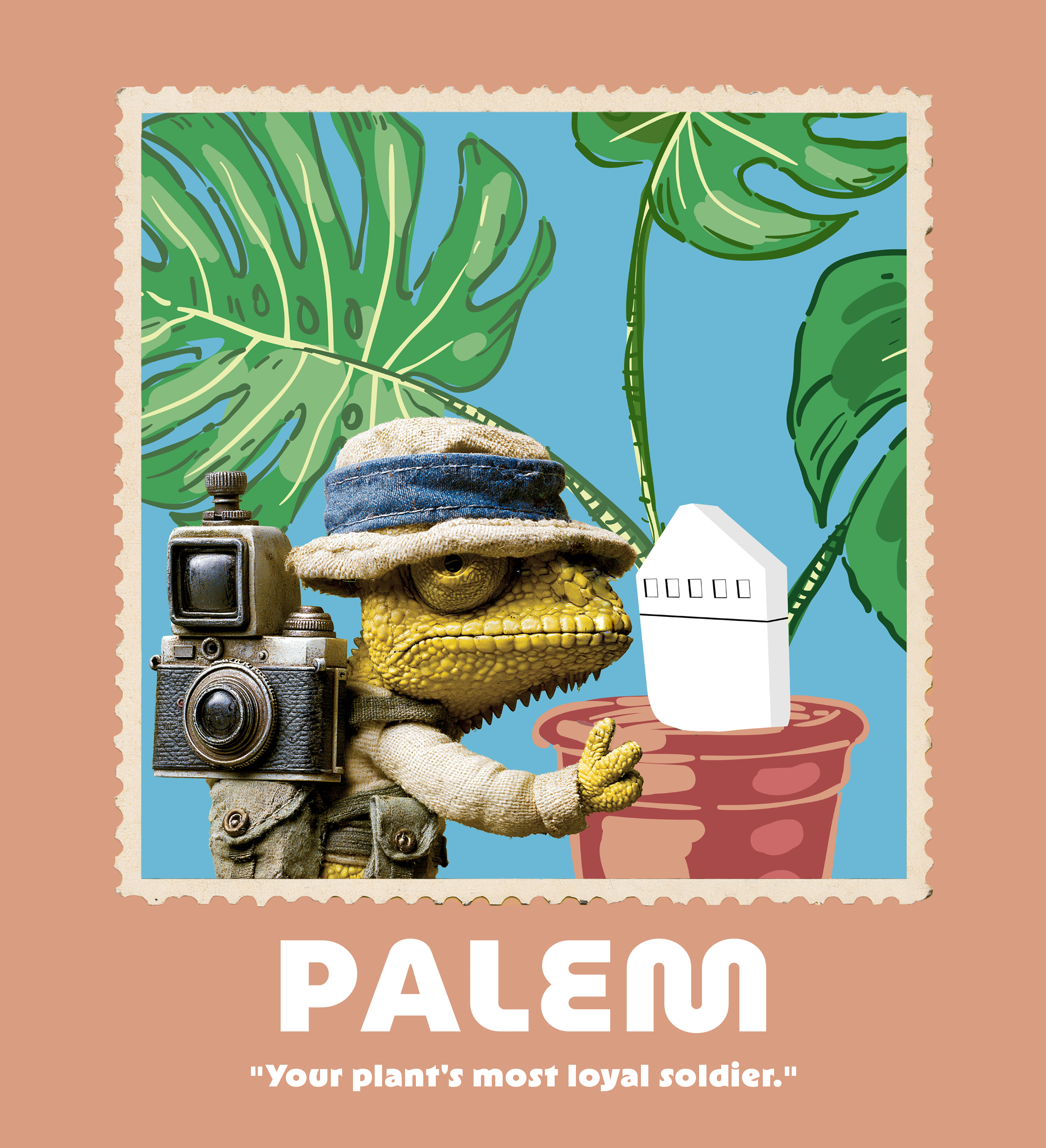
Palem — Your plant's most loyal soldier
Campaign Poster · Lizard Series
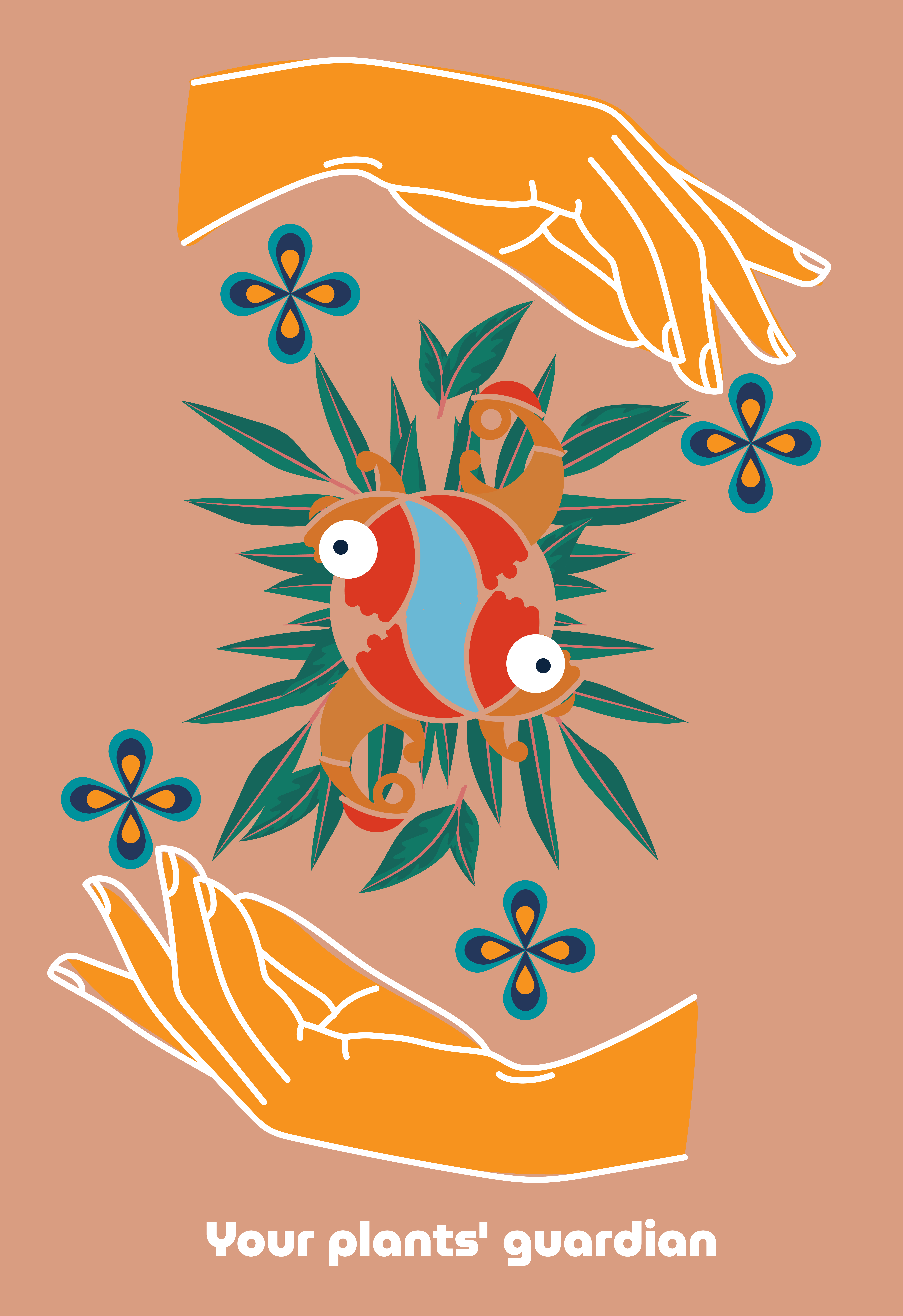
Palem — Your plants' guardian
Campaign Poster · Guardian
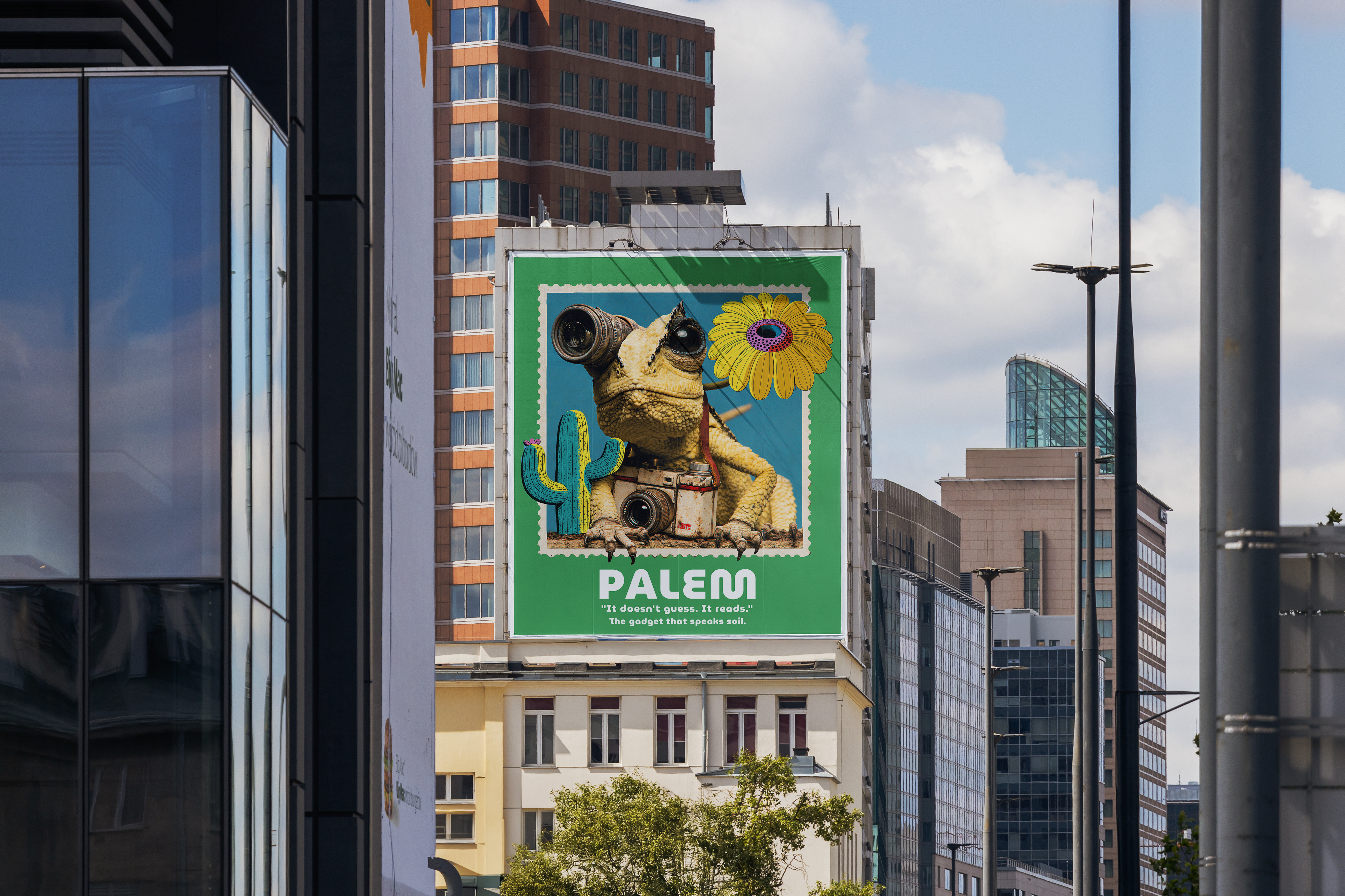
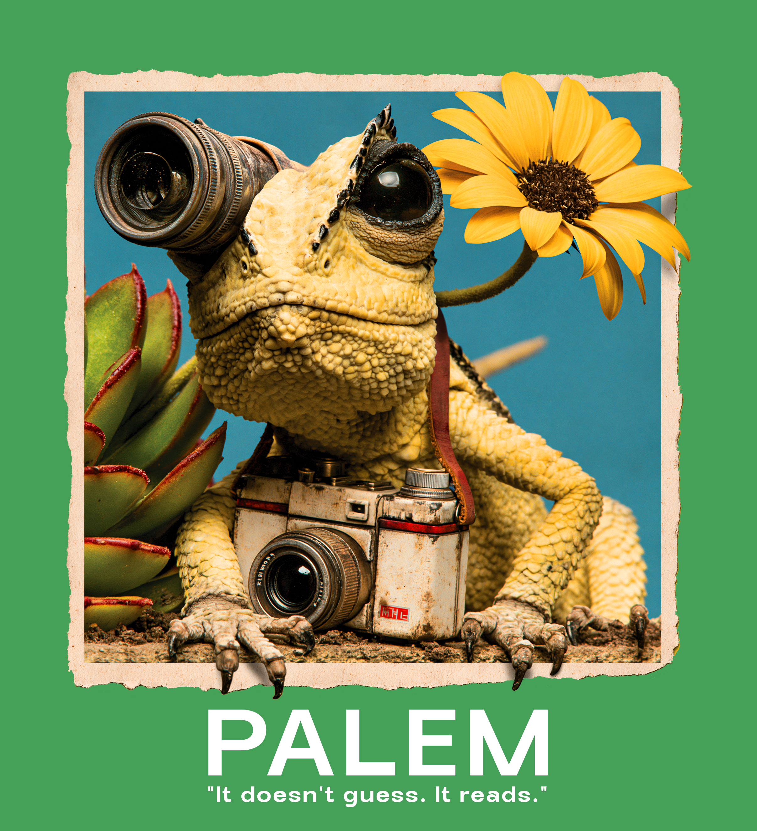
Palem — It doesn't guess. It reads.
Campaign Poster · Lizard Series
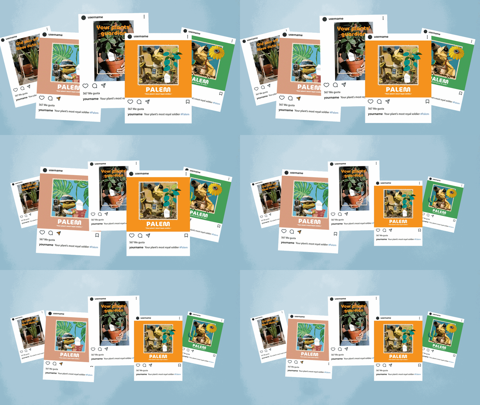
Palem Instagram campaign mockup
Palem Instagram campaign animation
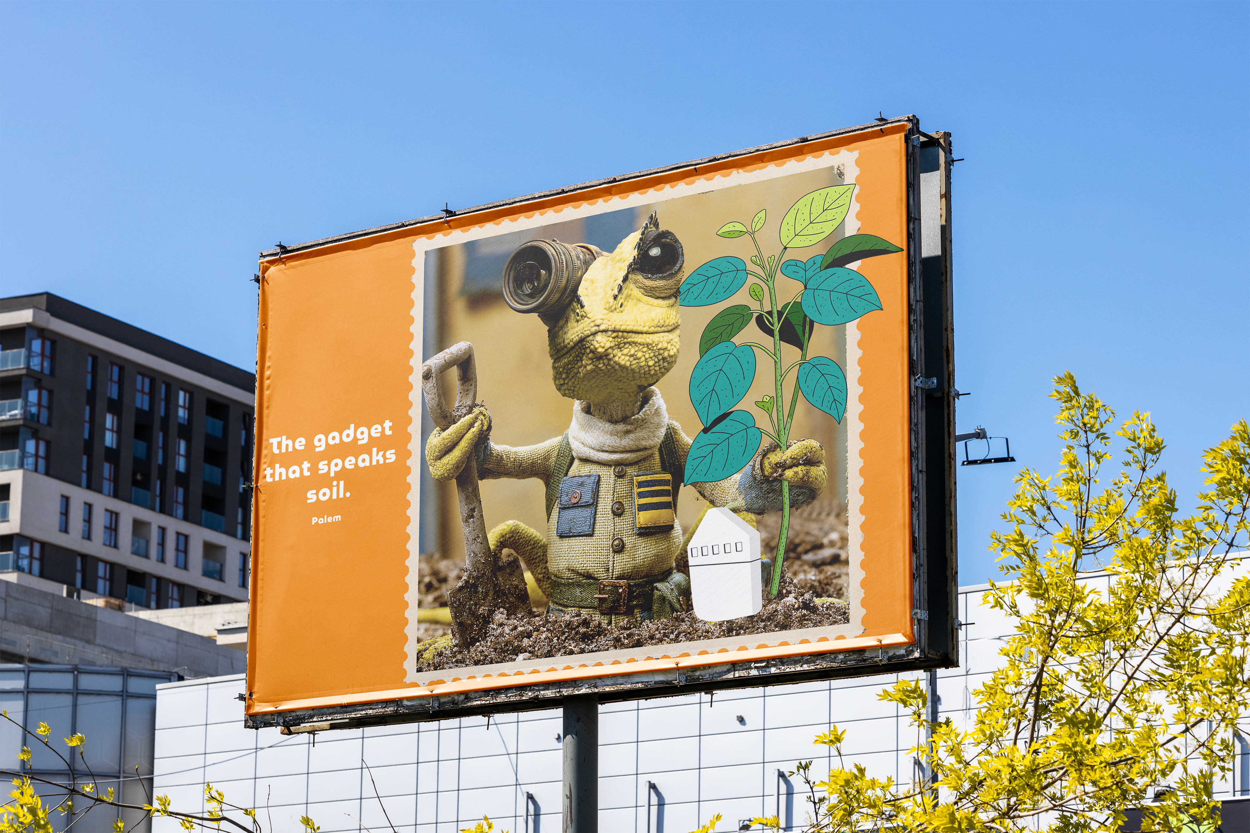
Palem campaign banner
Type & Colour

Visual
Language

Primary Typeface — MuseoModerno
MuseoModerno
Light 300Make Your Plants
Regular 400Great Again
Bold 700Old Skin Off
ExtraBold 800New Data In
A B C D E F G H I J K L M N O P Q R S T U V W X Y Z  ·  0 1 2 3 4 5 6 7 8 9
Brand Colour System
Palem Green
#45a058
Earth
#d07d37
Red Skin
#db3822
Sky
#6ab8d5
Dusk
#d99d81
Bark
#a94a4a
Sol
#f7931e

Plants
Healing

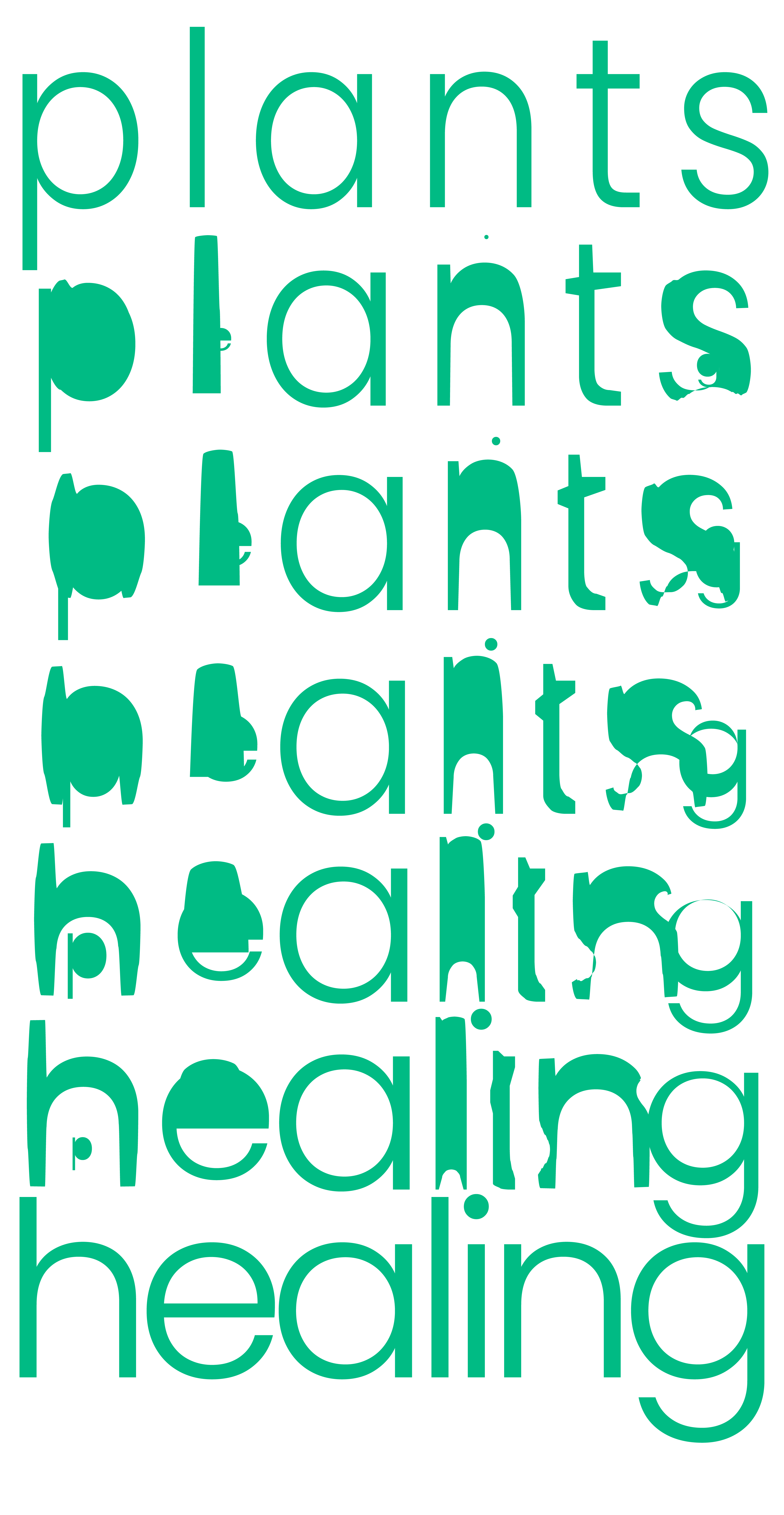
The typographic motion sequence transforms the word "plants" letter by letter into "healing" — illustrating the core promise of Palem: that with the right care, plants don't just survive, they thrive.

Plants to Healing typography motion
Palem logo geometric construction
Product Design

The App

Core Experience
Palem connects the physical sensor to a clean, intuitive mobile interface. The app translates raw sensor readings into human language — giving plant owners clear guidance on what their plant needs, when it needs it.
Key Features
  • Real-time plant health monitoring via wireless sensor
  • Personalised care recommendations per plant species
  • Problem diagnosis with visual symptoms guide
  • Watering and care history log
  • Local plant store finder and community tips
  • Sensor battery management and calibration
Design Principles
Calm, not clinical. Every screen is designed to feel like advice from a knowledgeable friend — never an overwhelming dashboard. The green palette brings nature into the digital space without feeling artificial.
Live prototype — tap to explore

System
Map

The app architecture flows from Open → Sign In → Core Actions (Analyse, Calculate, Problem, Solutions) through to Profile and History. The hardware sensor feeds real-time data into the platform, with the Processor and Data Converter bridging the physical and digital layers.

Palem app icon on iPhone
Research

Key
Insights

01
The Knowledge Gap
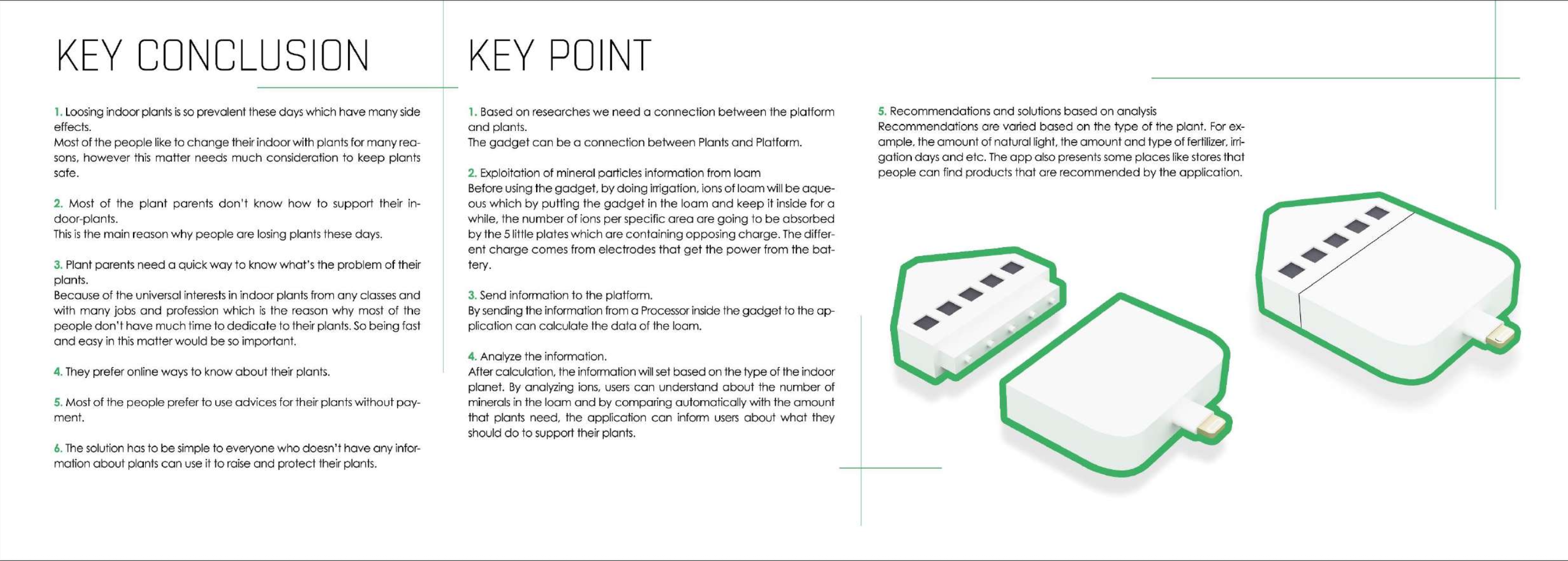
Most people own plants but have no systematic way to learn what each plant needs. Generic care cards are ignored — people want specific, real-time answers.
02
Busy Lives
Plant care fails not from lack of love but from lack of time. Automated reminders and passive sensing remove the burden of remembering.
03
Emotional Connection
Plant owners are emotionally invested. The design must validate that care and make them feel empowered — not lectured. Tone and copy matter as much as features.
Palem research — key conclusions and key points
Validation

User
Testing

12
Participants
2
Test Rounds
5
Core Tasks
3wk
Duration
Critical
Bluetooth Pairing Drop-off
Users hesitated or abandoned setup at the sensor pairing step — the screen gave no visual feedback during the 10-second connection window.
7 of 12 users affected · Onboarding flow
Critical
Technical Jargon
Terms like "Soil EC" and "VPD" confused non-expert users. Several assumed the sensor was broken rather than that they didn't understand the reading.
9 of 12 users confused · Dashboard labels
Moderate
Notification Fatigue
Daily reminders felt overwhelming after the first week. Users started ignoring all notifications — including critical alerts — by day 10.
5 of 12 users disabled alerts · Notification settings
Critical
Missing Trust Signal
Users wanted to know exactly what data the sensor collects and where it goes. Without a clear explanation, several felt uncomfortable proceeding past setup.
6 of 12 users raised concern · Onboarding
Moderate
Plant History Hidden
The plant health timeline was buried three levels deep. Only 3 of 12 users found it on the first attempt without guidance.
3 of 12 found it unaided · Navigation
Moderate
Tone Mismatch
Copy read like a science report. Users expected a friendly, encouraging voice — not a clinical one. The emotional connection was lost in the language.
8 of 12 users noted tone · All screens
"I love the concept — but when it said 'Soil EC: 1.8 mS/cm' I thought something was wrong with the sensor. I had no idea what that meant."
Participant 04 · Plant owner, 28
"Once I understood what it was telling me, I couldn't stop checking it. But getting there felt like reading a manual."
Participant 09 · Plant owner, 34
"I got so many notifications in the first week that I turned them all off — and then forgot about the app entirely."
Participant 11 · Plant owner, 41
"It felt like it was talking to a botanist, not to me. I just want to know: does my plant need water today? Yes or no."
Participant 02 · Plant owner, 25
Iterations Made After Testing
Renamed all technical metrics"Soil EC" became "Soil Richness", "VPD" became "Air Dryness" — plain language throughout.
Animated pairing guide addedA step-by-step illustration with real-time status feedback replaced the blank waiting screen.
Notification default changed to weeklyUsers now set their own frequency in onboarding — daily is opt-in, not the default.
Data transparency screen in onboardingA single screen explains what is collected, where it goes, and how to delete it — added to step 2 of setup.
Plant history surfaced to homeA 7-day sparkline now lives on the main plant card — history visible without any navigation.
Copy rewritten in friendly voiceAll in-app copy revised to feel like advice from a knowledgeable friend, not a care manual.